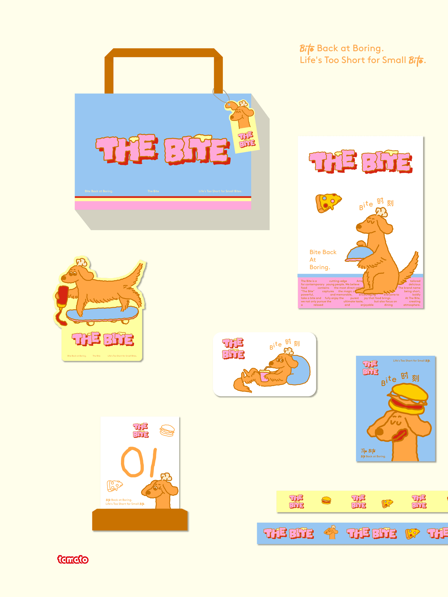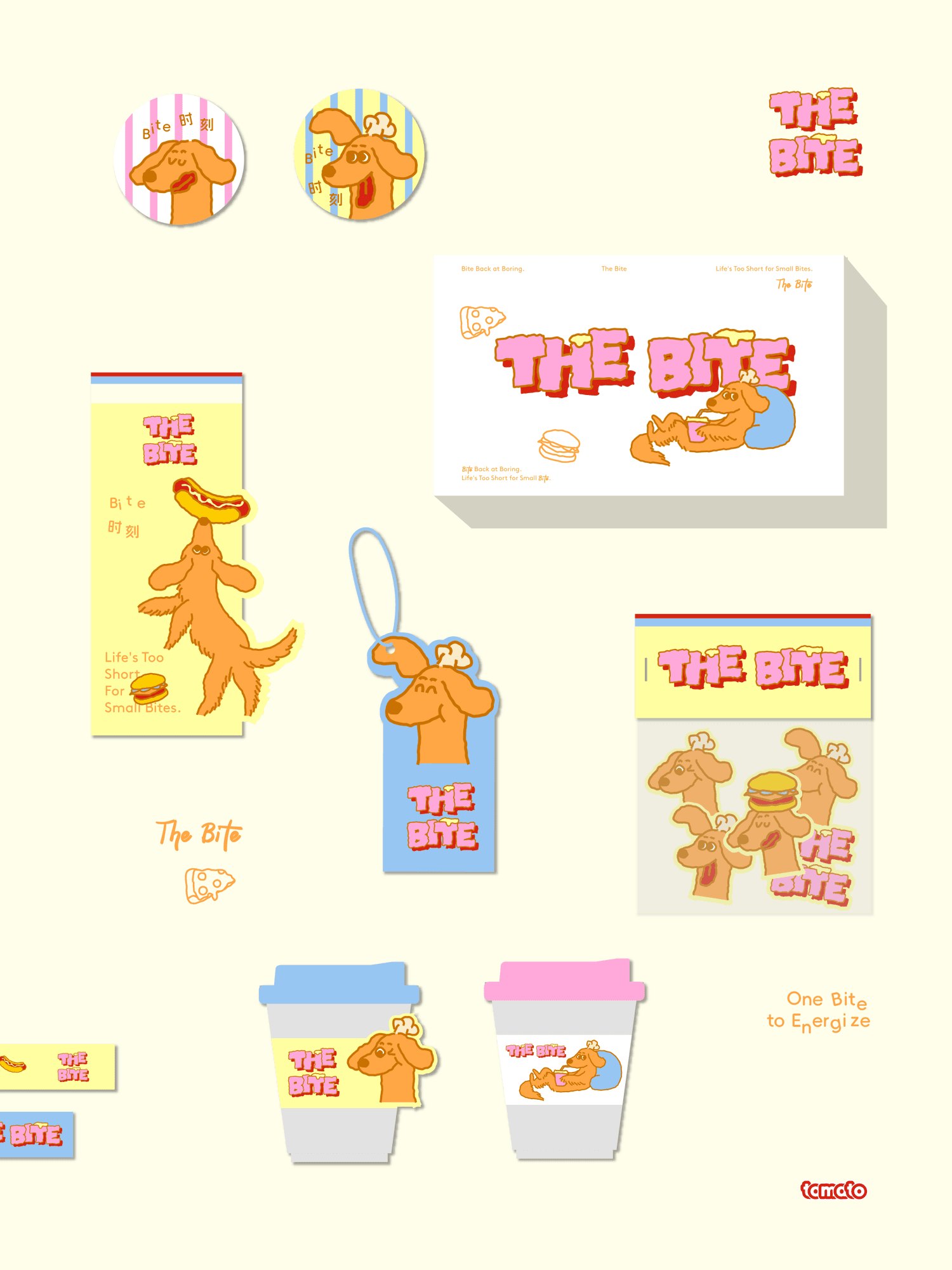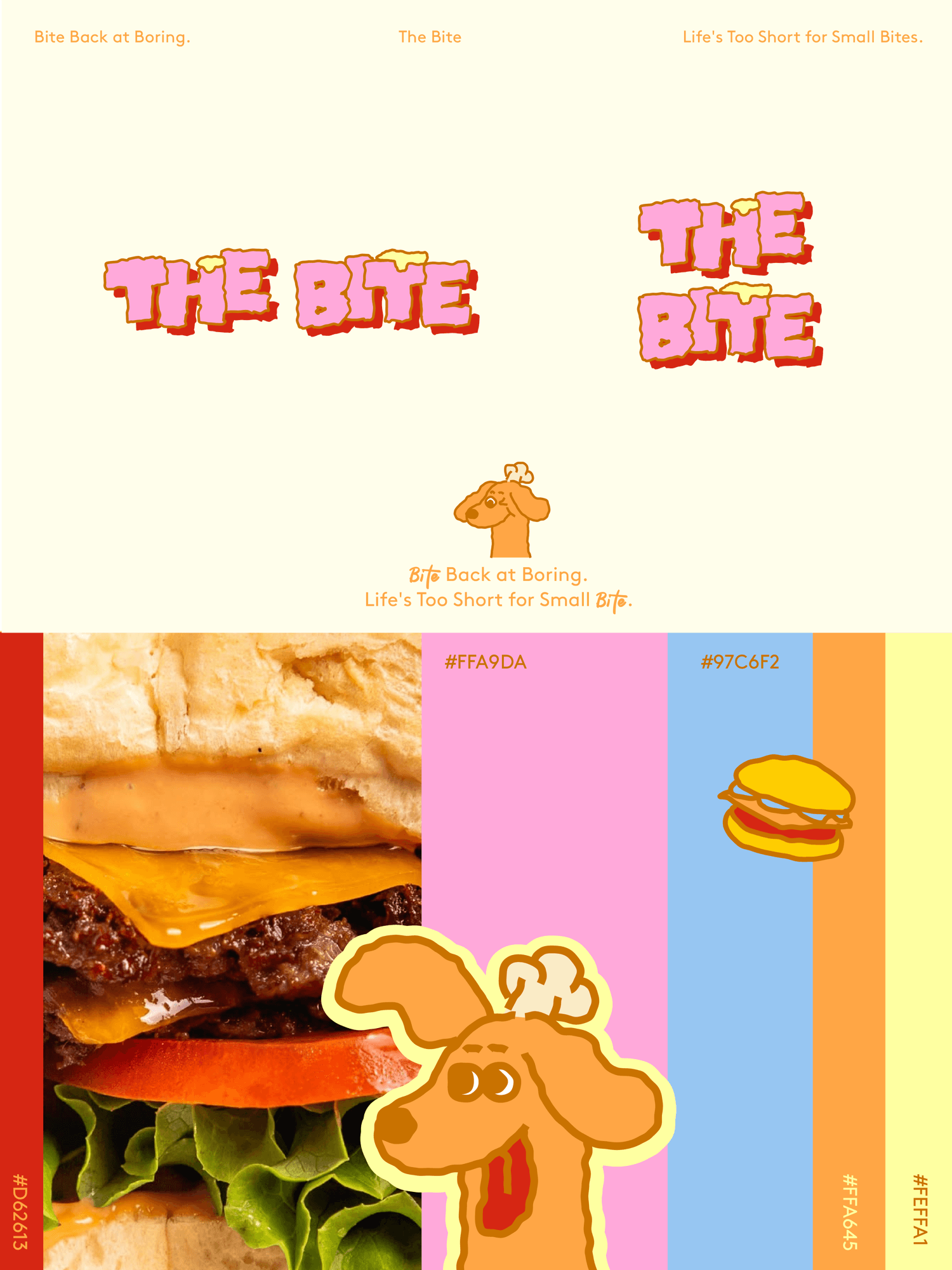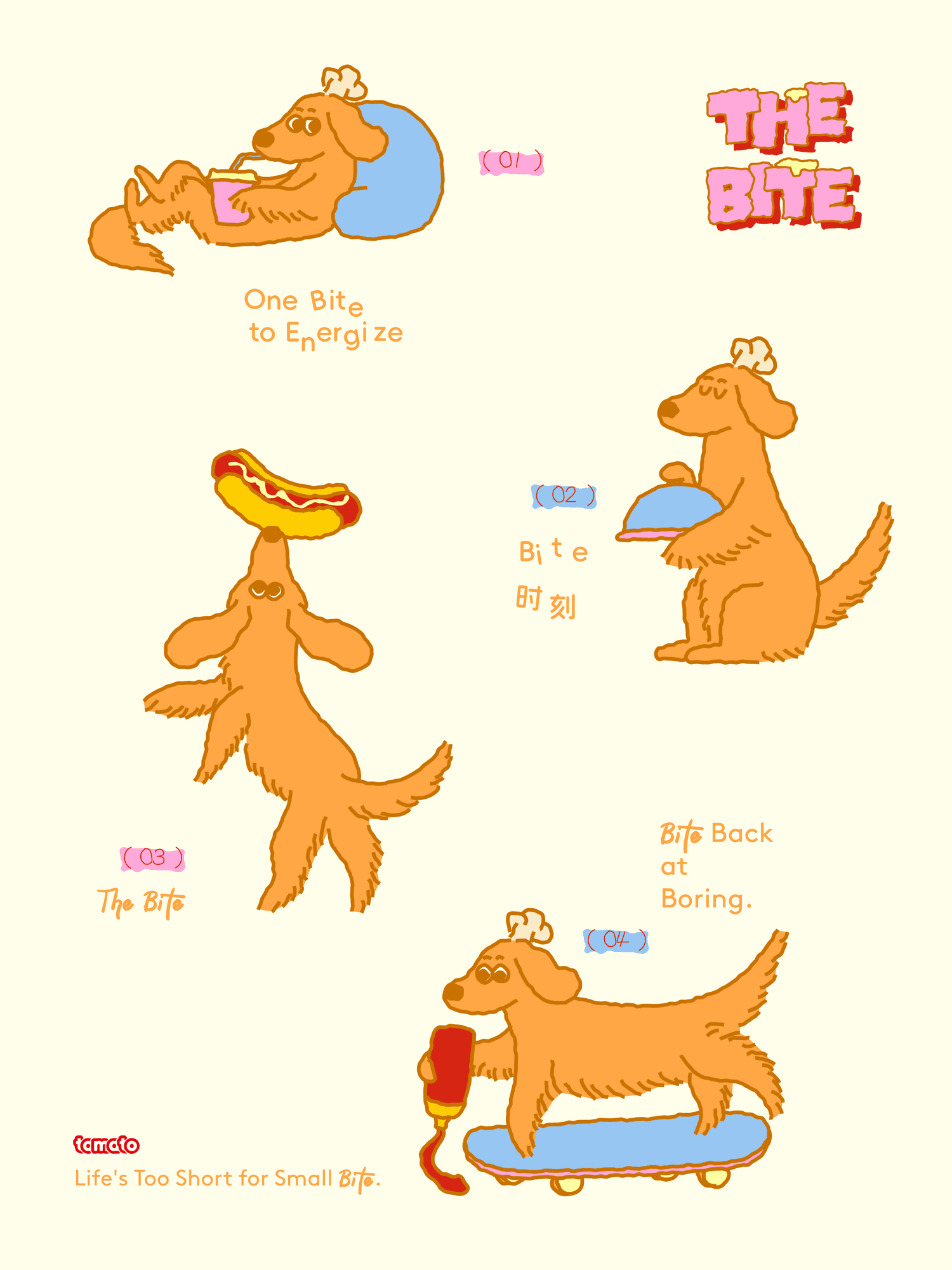
THE BITE
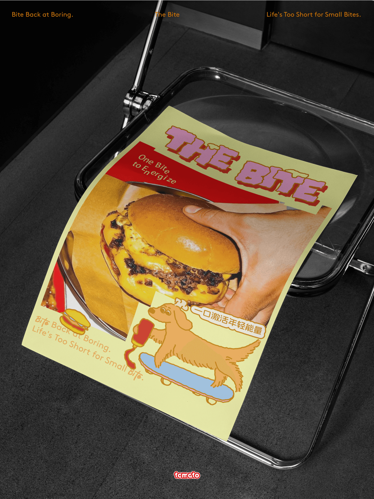
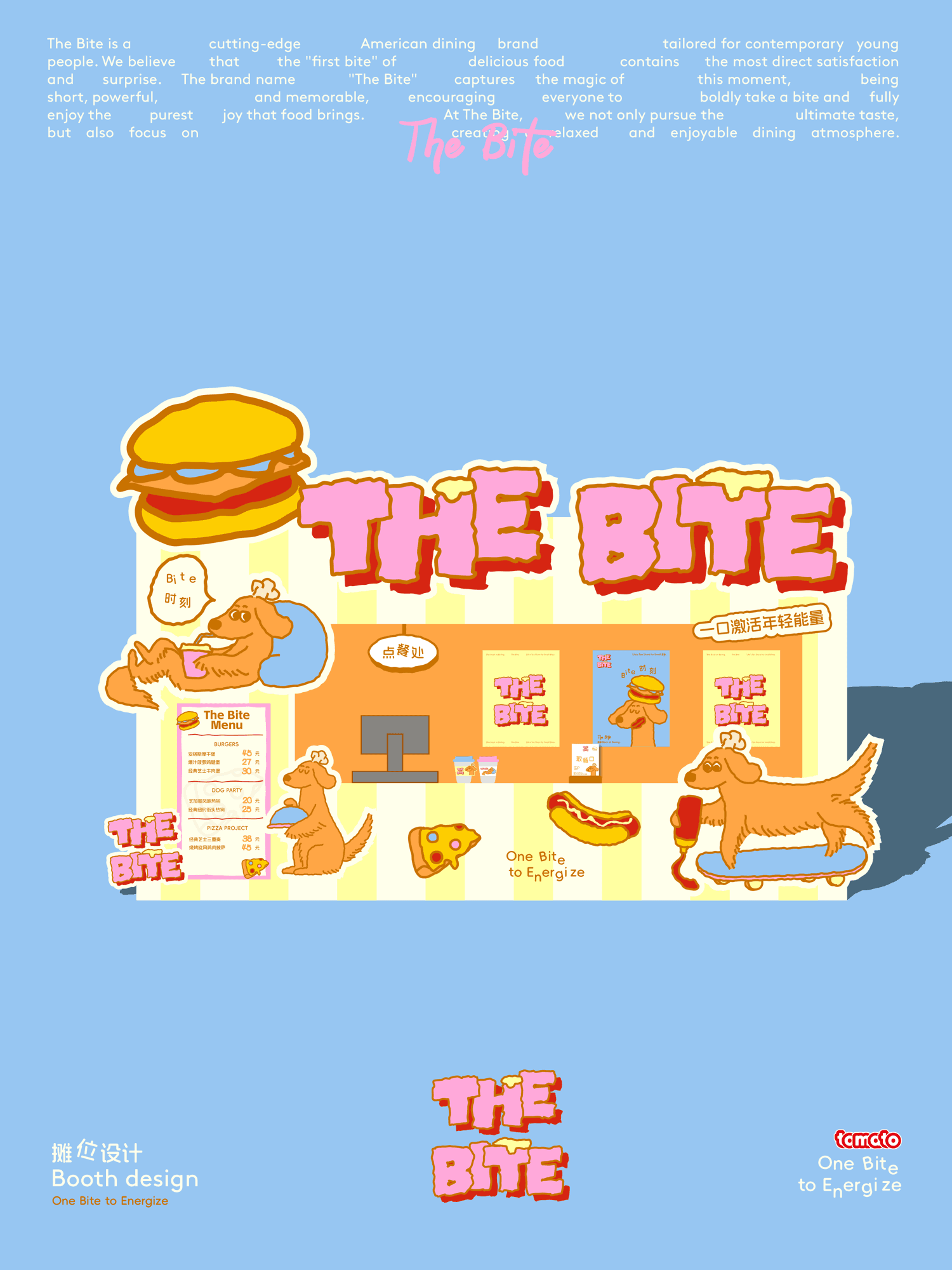
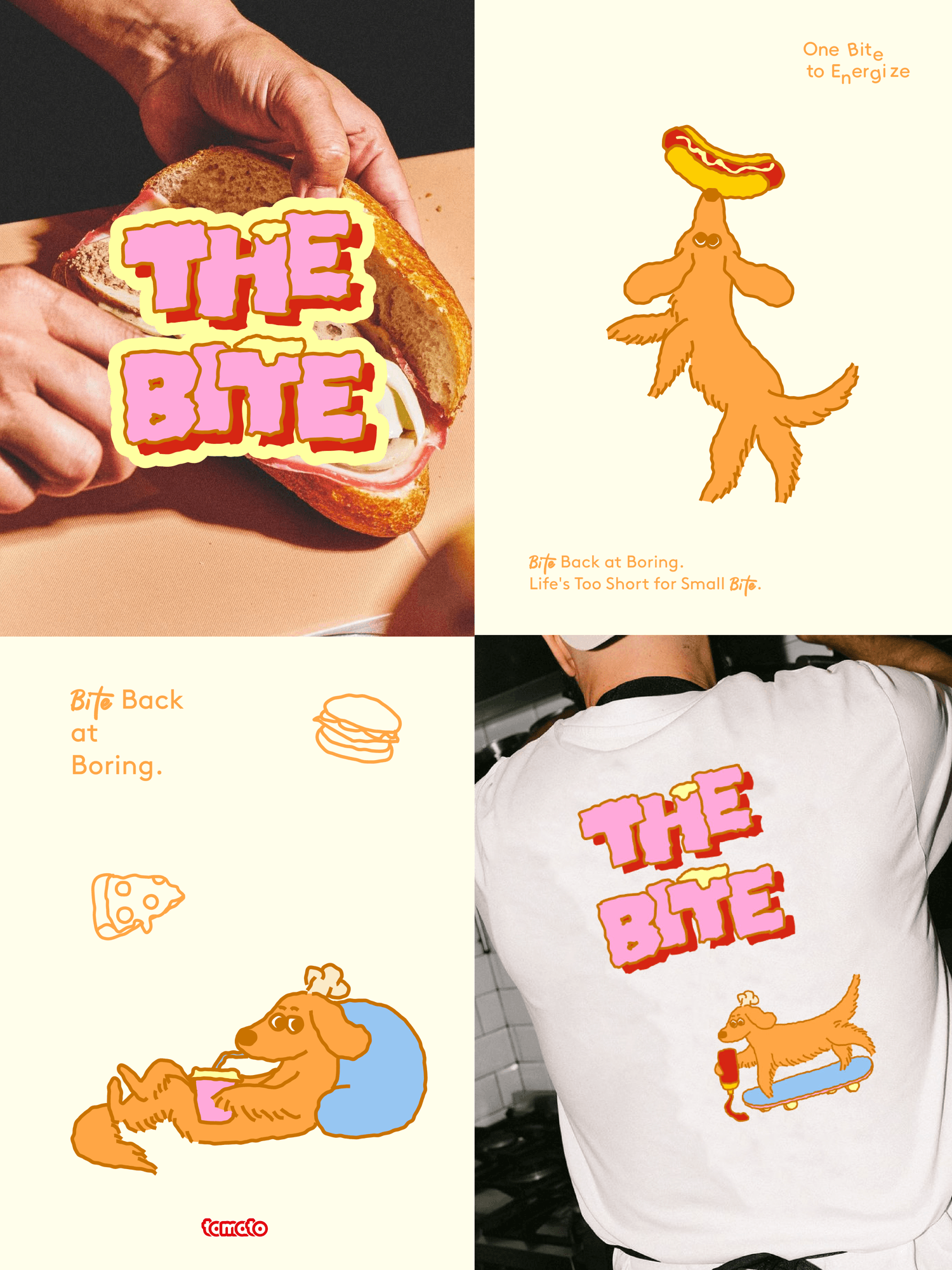
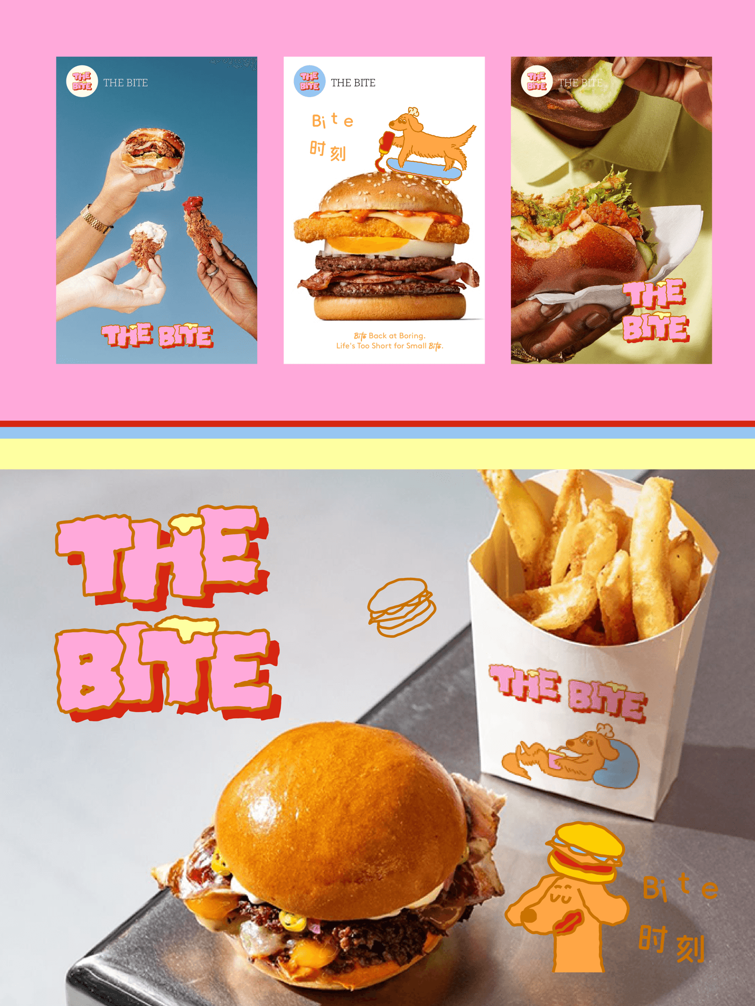
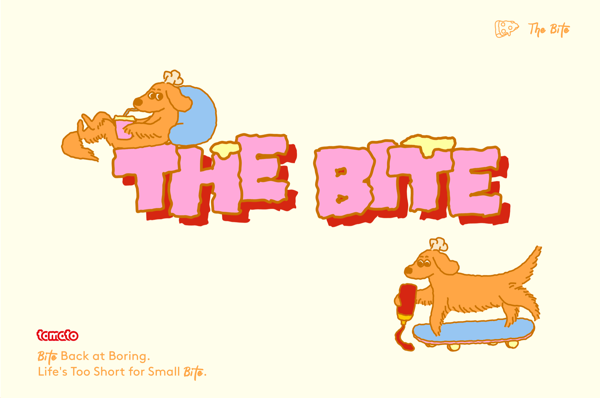
THE BITE是一家以"一口激活年轻能量 | One Bite to Energize"为核心理念,通过多巴胺配色、小金毛IP设计和温暖趣味的表达,定义年轻群体的美式汉堡快餐美学体验。设计上我们摒弃传统快餐品牌的工业化冰冷感,转而拥抱一种"可口的愉悦感"——它不仅是味觉的满足,更是视觉与情感的双重体验,传递品牌发自内心的愉悦与分享精神。色彩上我们采用多巴胺配色,让品牌整体明亮与温暖。可爱的小金毛IP天生具有友好、快乐的特质,作为品牌在不同场景中的动态出现,将零散的消费触点串联成有温度的品牌叙事,增强品牌识别度与亲和力。
THE BITE is built around the core concept of "one bite to energize the young | One Bite to Energize," using dopamine color schemes, a golden retriever IP, and warm, playful expression to define the American burger fast-food aesthetic experience for younger groups. In design, we abandon the industrial coldness of traditional fast-food brands, instead embracing a "delicious sense of pleasure"—it is not only the satisfaction of taste, but a dual experience of vision and emotion, conveying the brand's heartfelt joy and spirit of sharing. For color, we use a dopamine palette, making the brand overall bright and warm. The cute golden retriever IP is naturally friendly and joyful; as the brand's dynamic presence across different scenes, it strings scattered consumer touchpoints into a warm brand narrative, strengthening brand recognition and affinity.