Meow Cafe
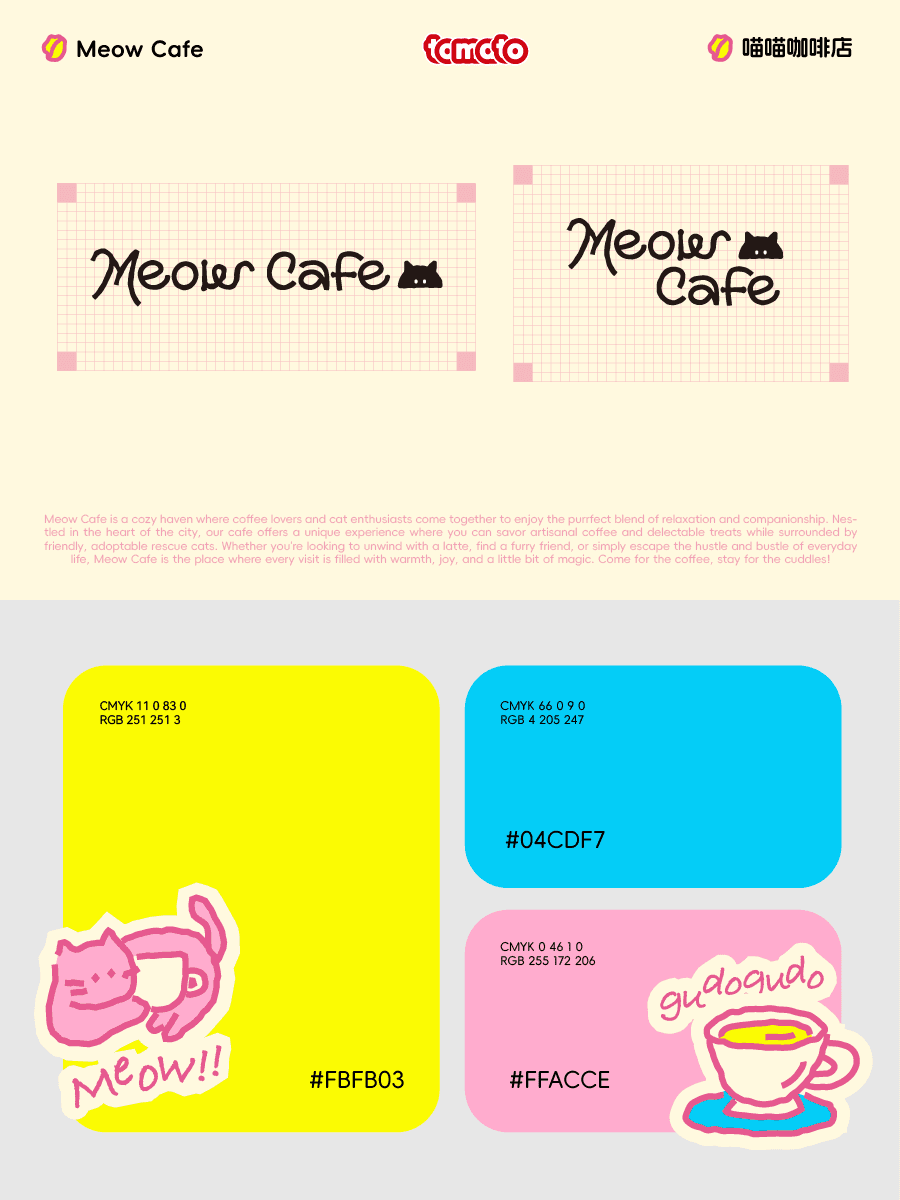
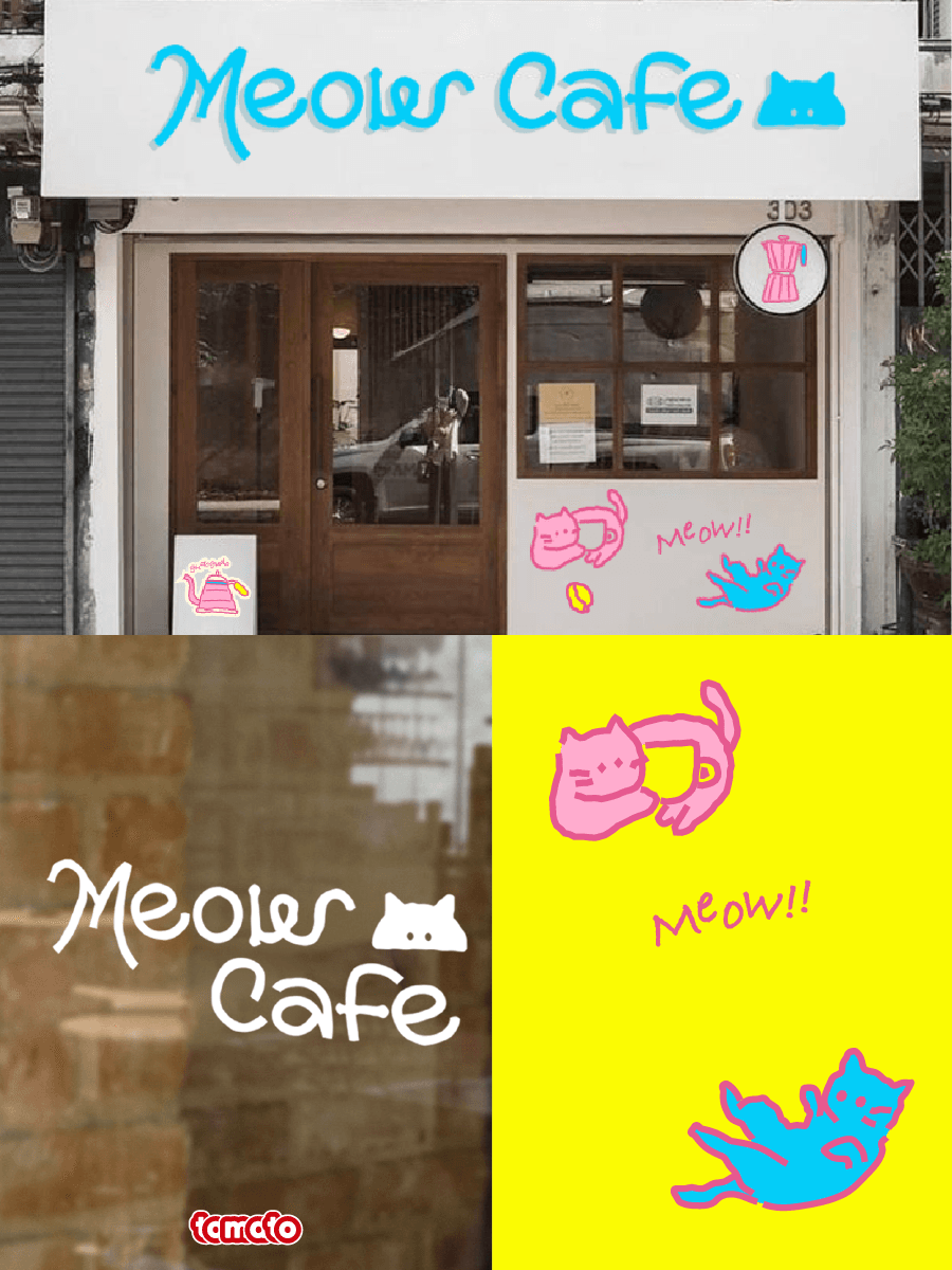
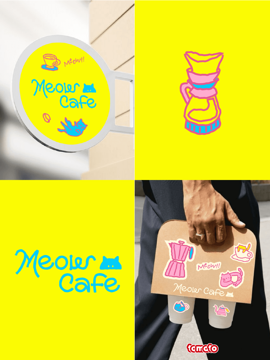
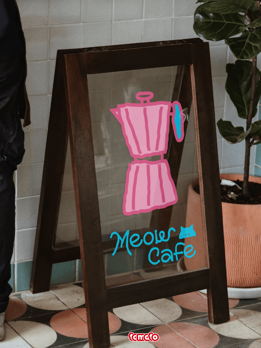
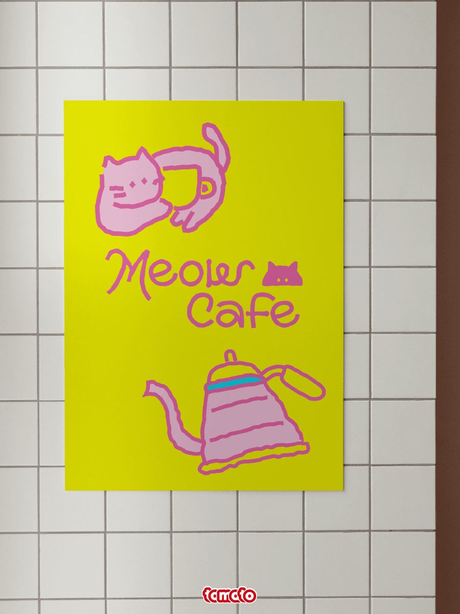
Meow Cafe的品牌视觉设计以"猫咪的治愈力"为核心,我们将猫咪的灵动与咖啡文化巧妙结合,传递出轻松、治愈、愉悦的品牌调性,为消费者带来独特的视觉体验和情感共鸣。颜色上我们采用亮黄色、蓝色和粉色作为主色调,三种色彩的碰撞既充满视觉冲击力,形成独特的品牌记忆点。Meow Cafe的品牌视觉设计通过猫咪与咖啡的结合,打造了一个充满温度与治愈力的品牌形象,在情感上引发共鸣,为品牌注入持久的生命力。
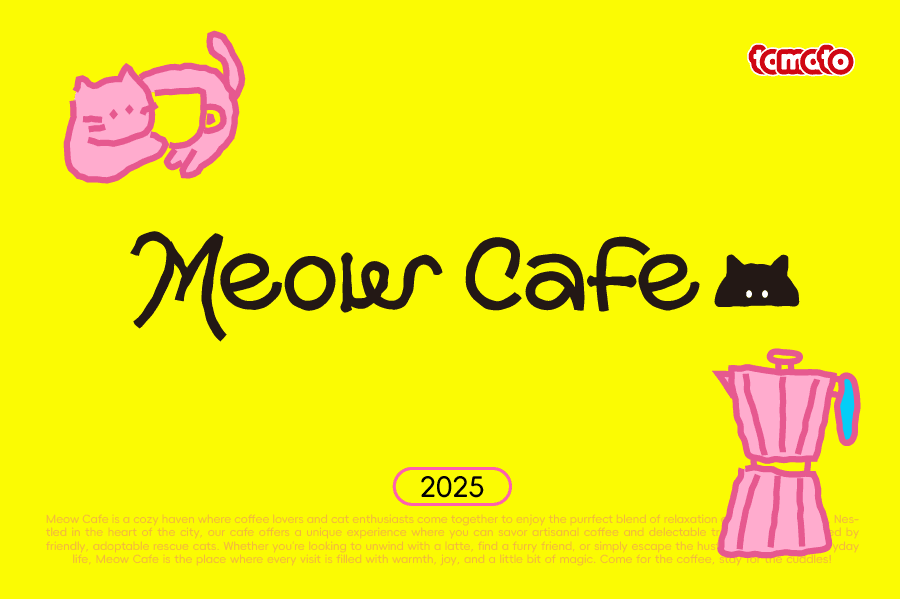
Meow Cafe's brand visual design centers on the "healing power of cats." We cleverly combine the liveliness of cats with coffee culture, conveying a relaxed, healing, and joyful brand tone, bringing consumers a unique visual experience and emotional resonance. For color, we use bright yellow, blue, and pink as the main tones; the collision of the three colors is full of visual impact, forming a unique brand memory point. Meow Cafe's brand visual design, through the combination of cats and coffee, crafts a brand image full of warmth and healing power, resonating emotionally and injecting lasting vitality into the brand.