Euphor
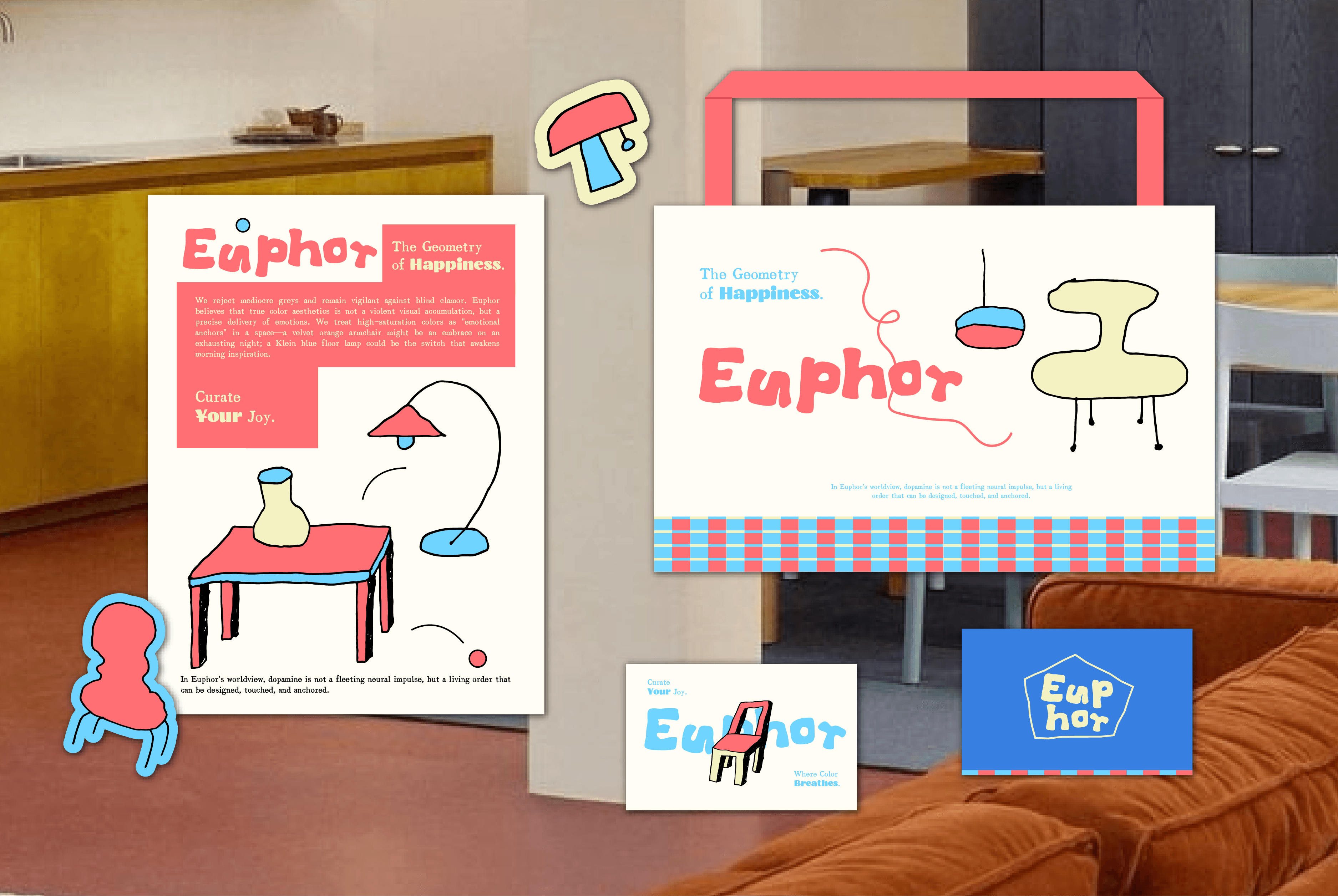
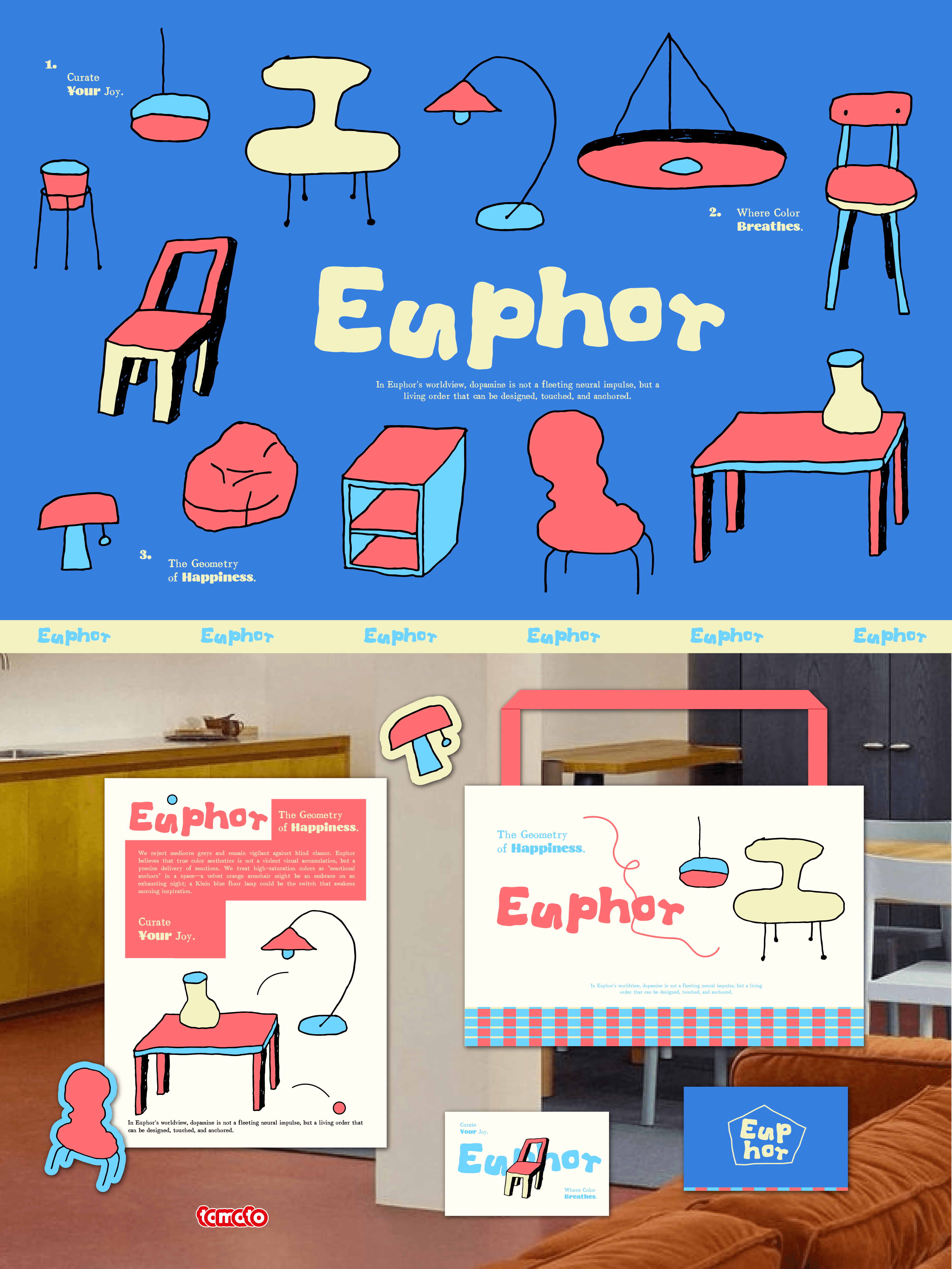
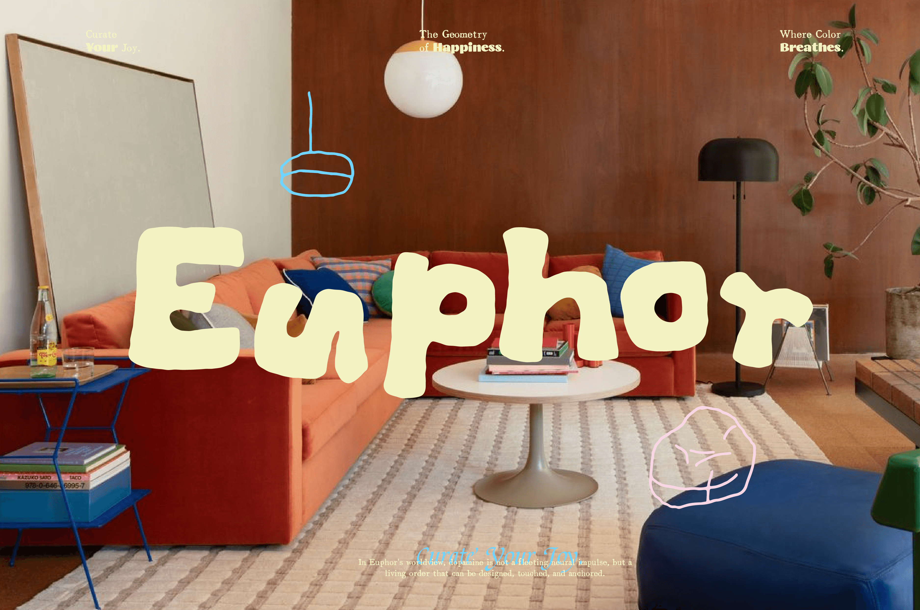
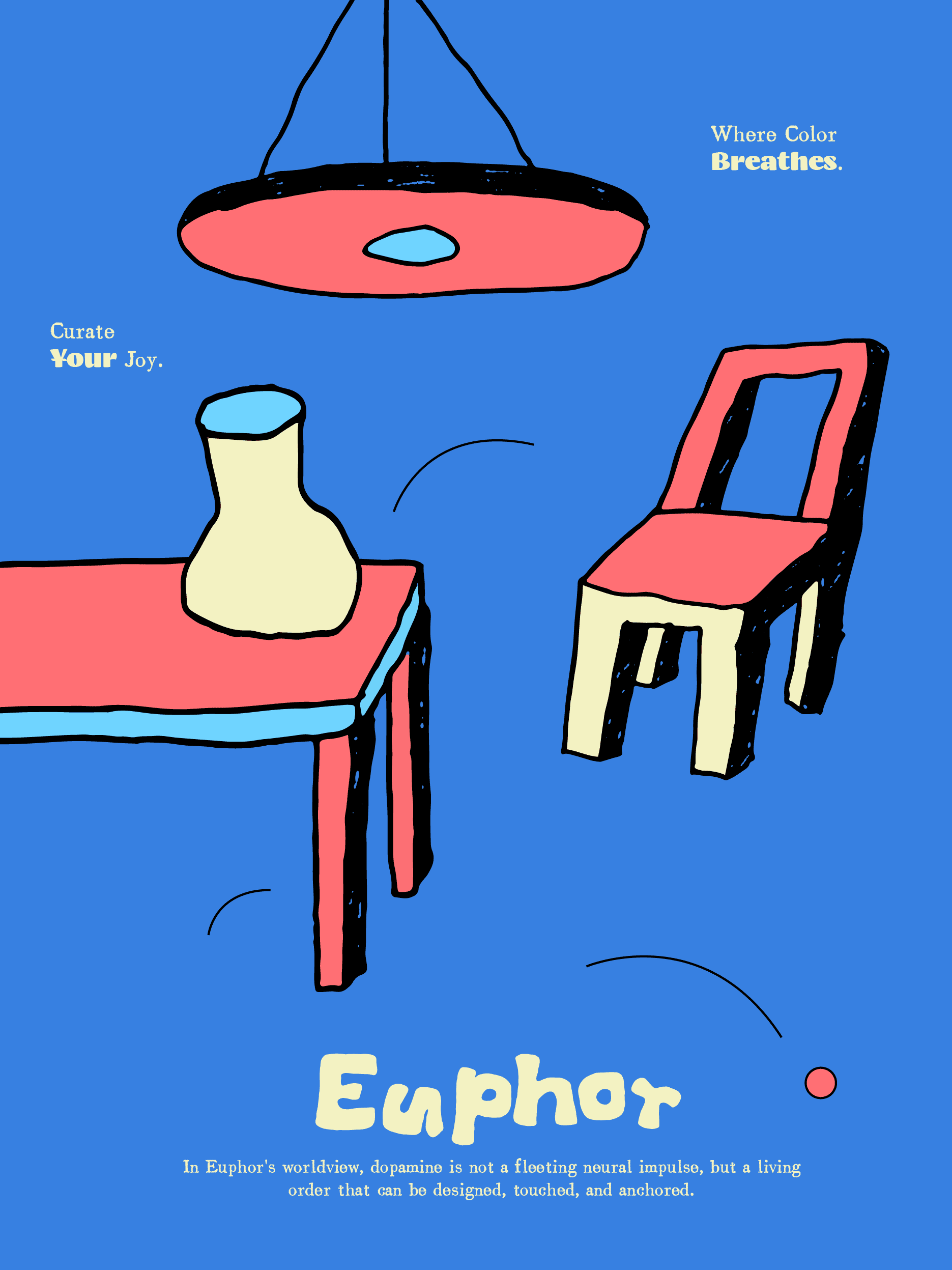
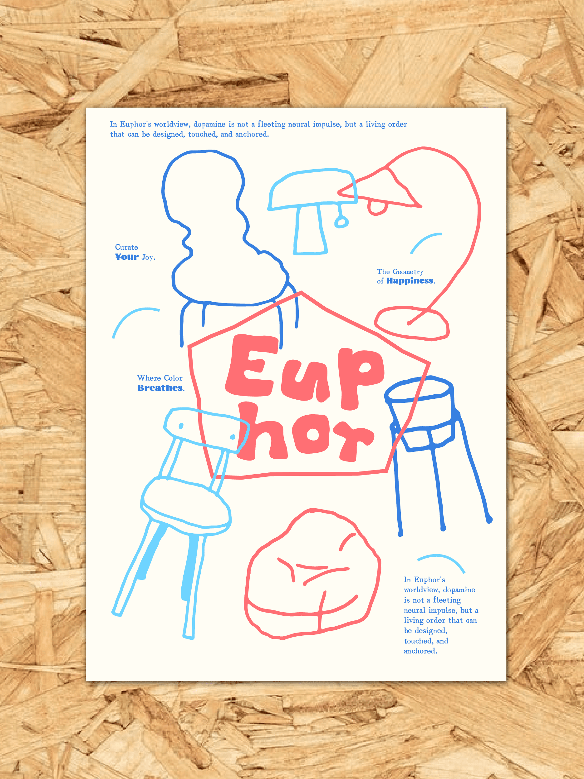
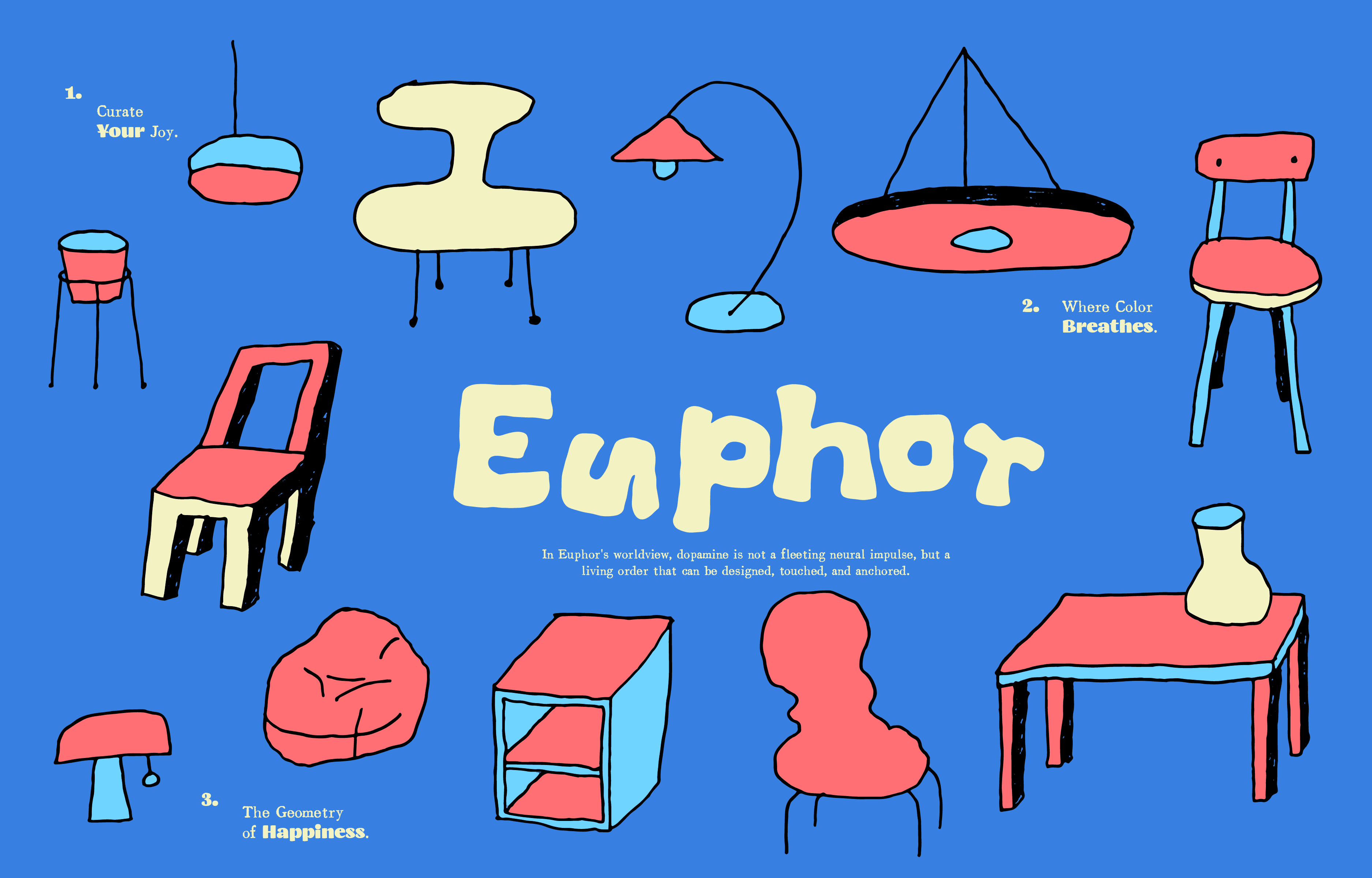
Euphor是一家家居品牌集合店,我们在为Euphor 的设计视觉语言选择了一种"反叛"的姿态。Euphor 的视觉基底由最纯粹的红、黄、蓝三原色构成。它们以最直接、最原始的姿态碰撞,这种色彩策略是情绪的具象化,大面积的色块在粗糙的质感中相互交织,将高饱和的色彩沉淀为一种具有呼吸感的艺术表达。用粗糙的线条对抗精致,用原色的碰撞对抗平庸,用手绘的温度对抗冷漠。在 Euphor 的世界里,多巴胺不是一种浮夸的潮流,而是一种可以被触摸、被感受、被生活化的真实情绪。这种拙感,正是我们对"悦己"最诚恳的表达。
Euphor is a multi-brand home goods store. We chose a "rebellious" stance for Euphor's visual language. Euphor's visual foundation consists of the purest red, yellow, and blue primaries. They collide in their most direct, primitive form — this color strategy externalizes emotion; large color blocks interweave within rough textures, settling the high-saturation colors into an artistic expression that breathes. Rough lines counter refinement, primary-color collisions counter the ordinary, the warmth of hand-drawn marks counters indifference. In Euphor's world, dopamine isn't a flashy trend but a real emotion that can be touched, felt, and lived. This clumsiness is our most sincere expression of "pleasing oneself."