Scoopie
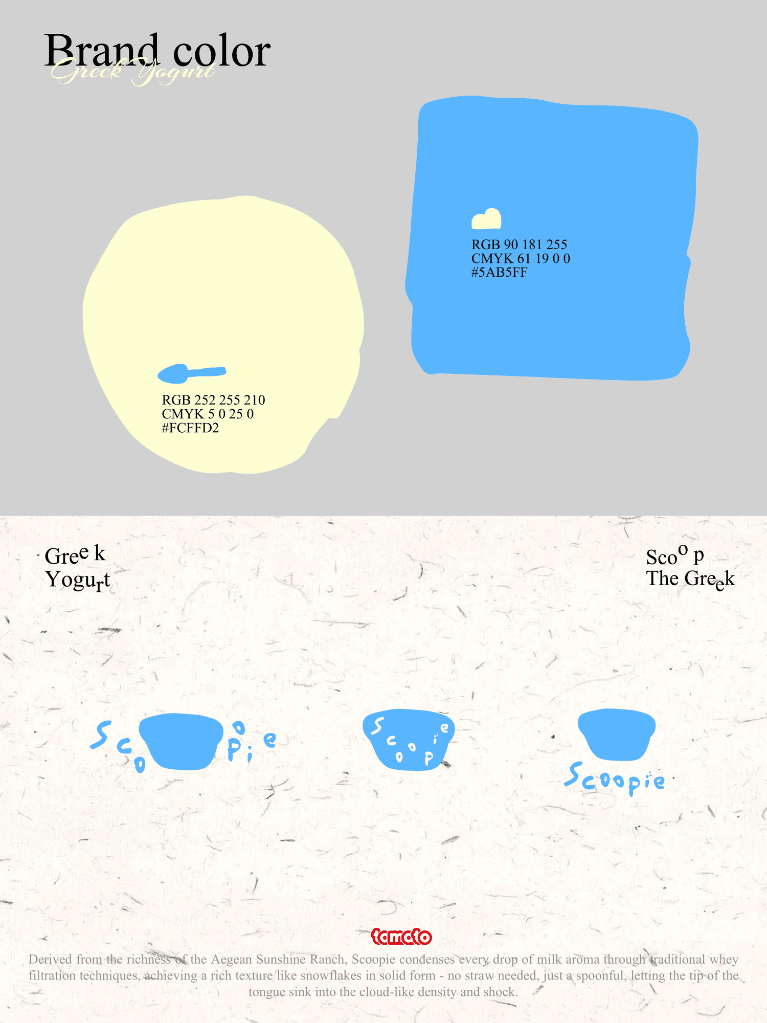
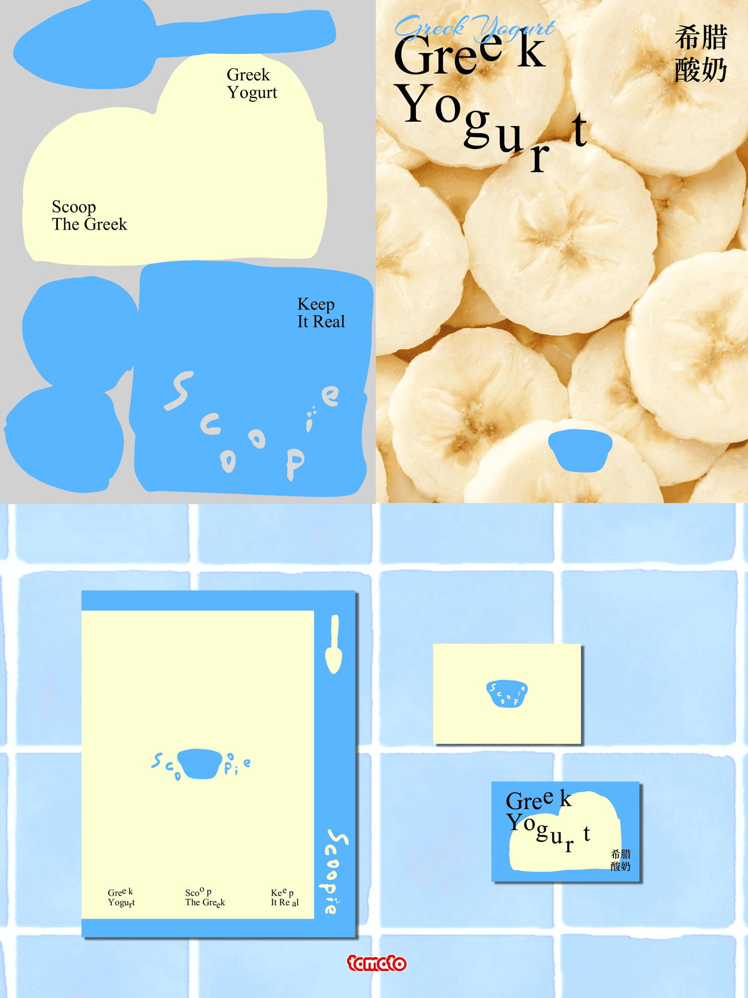
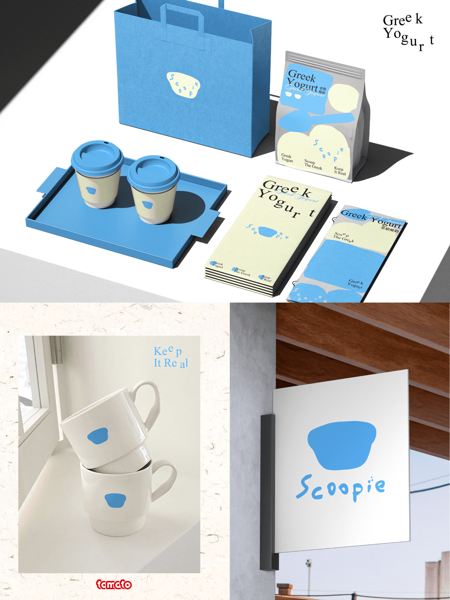
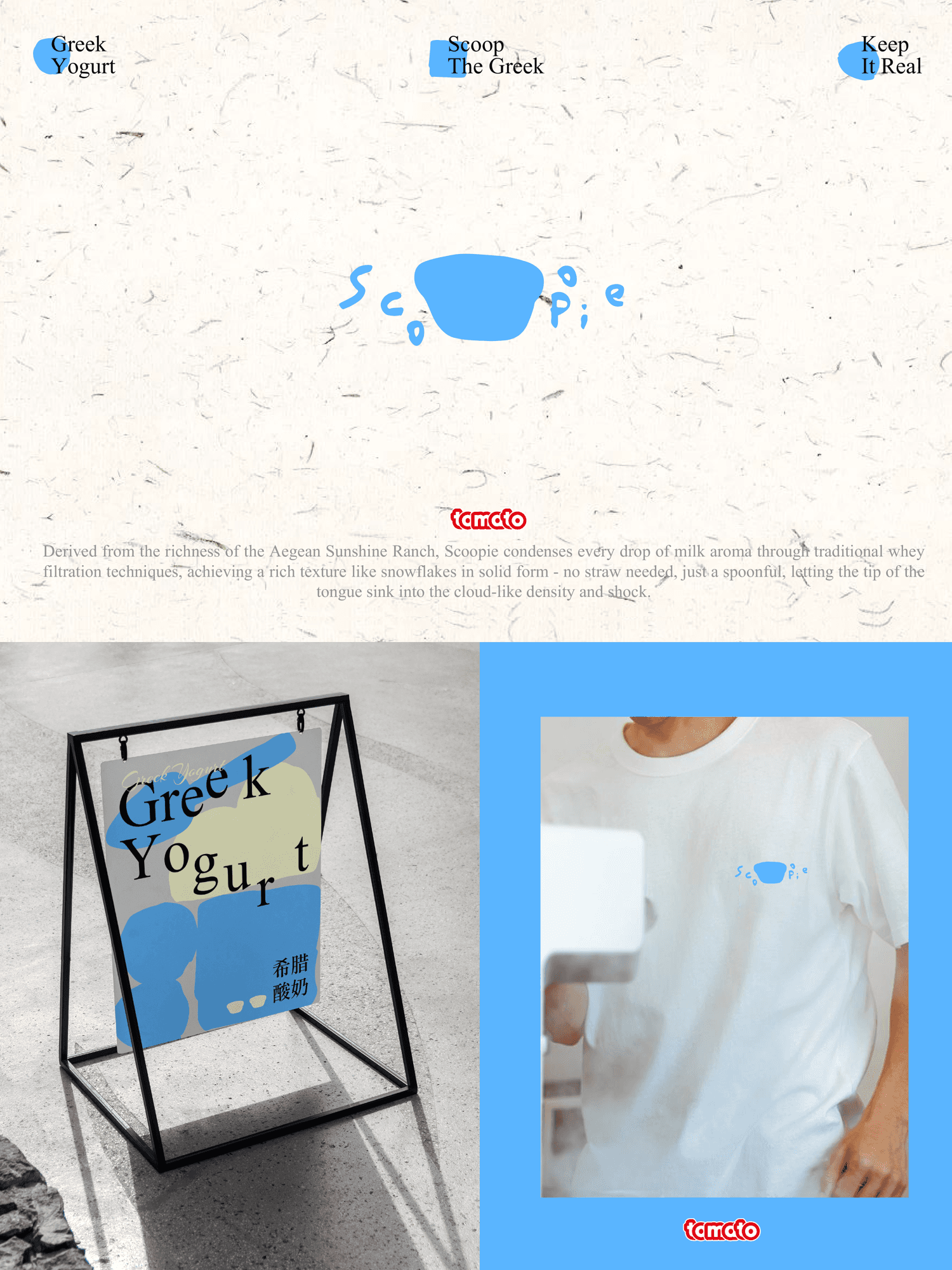
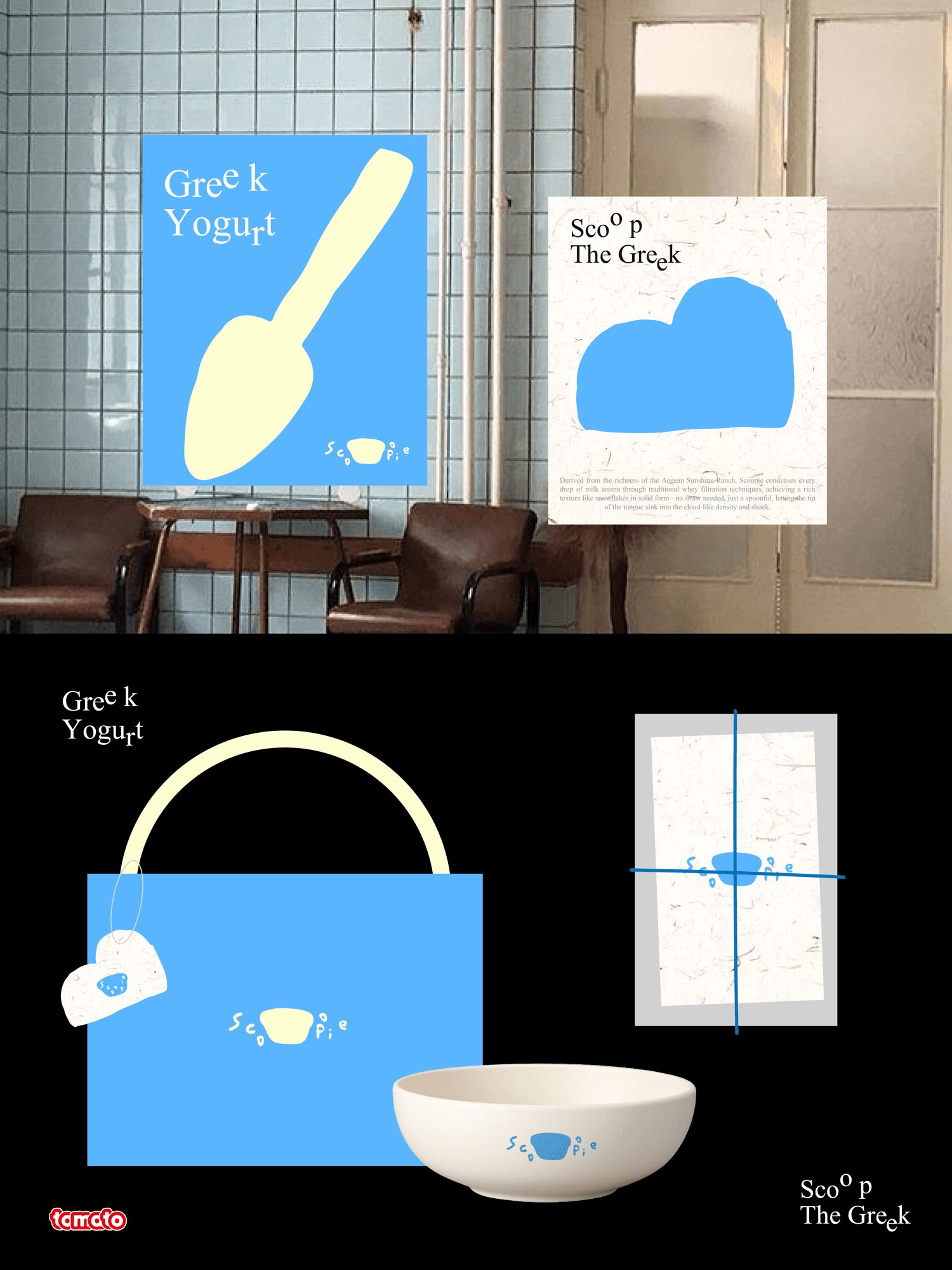
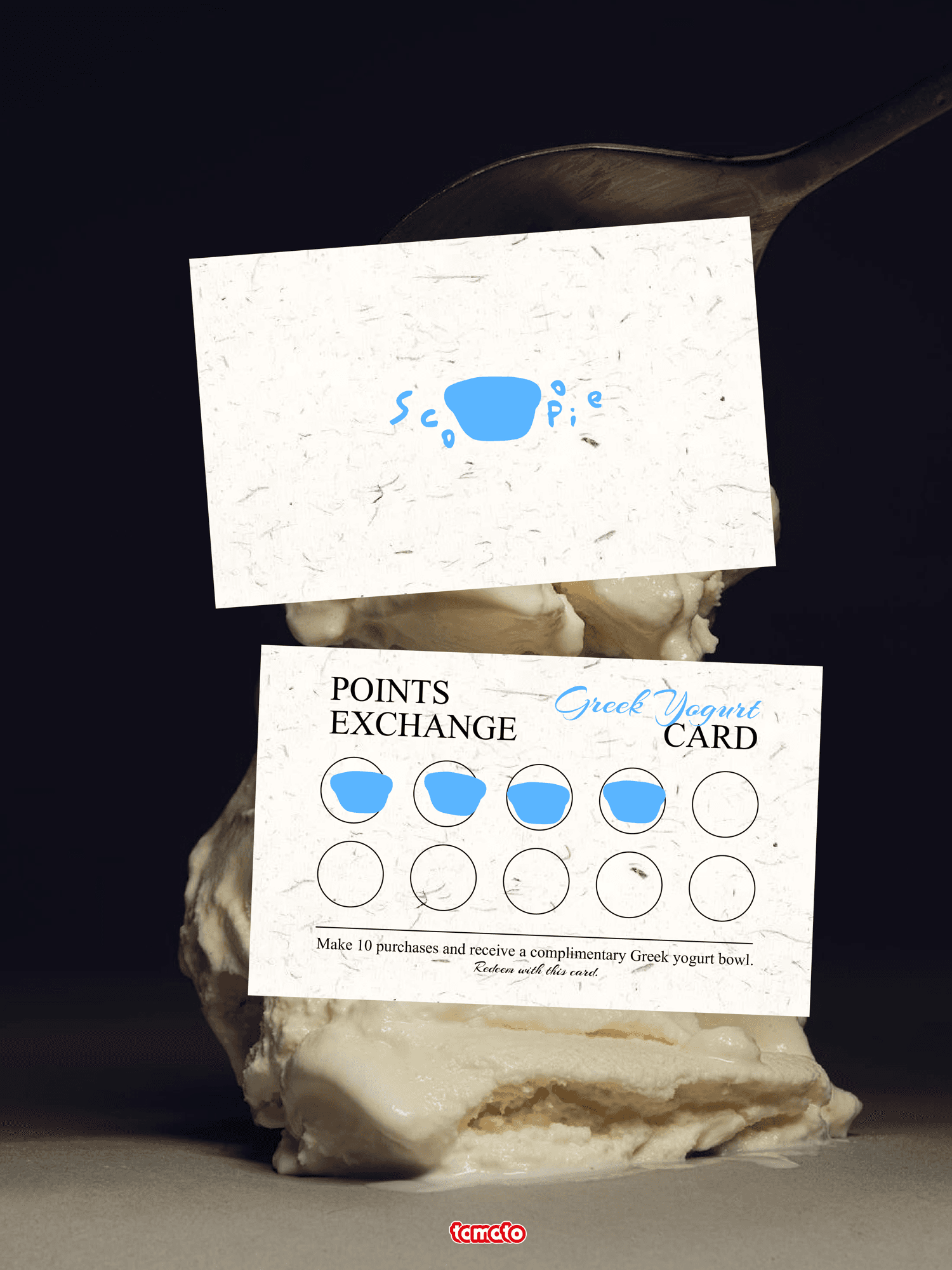
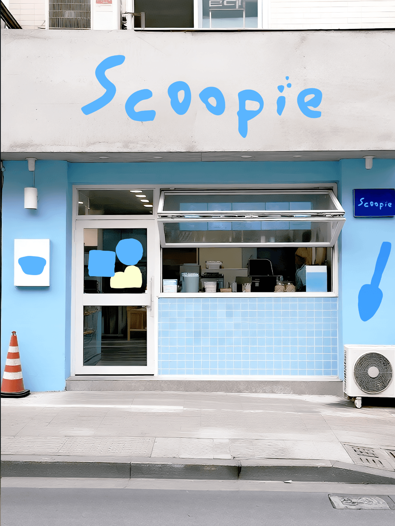
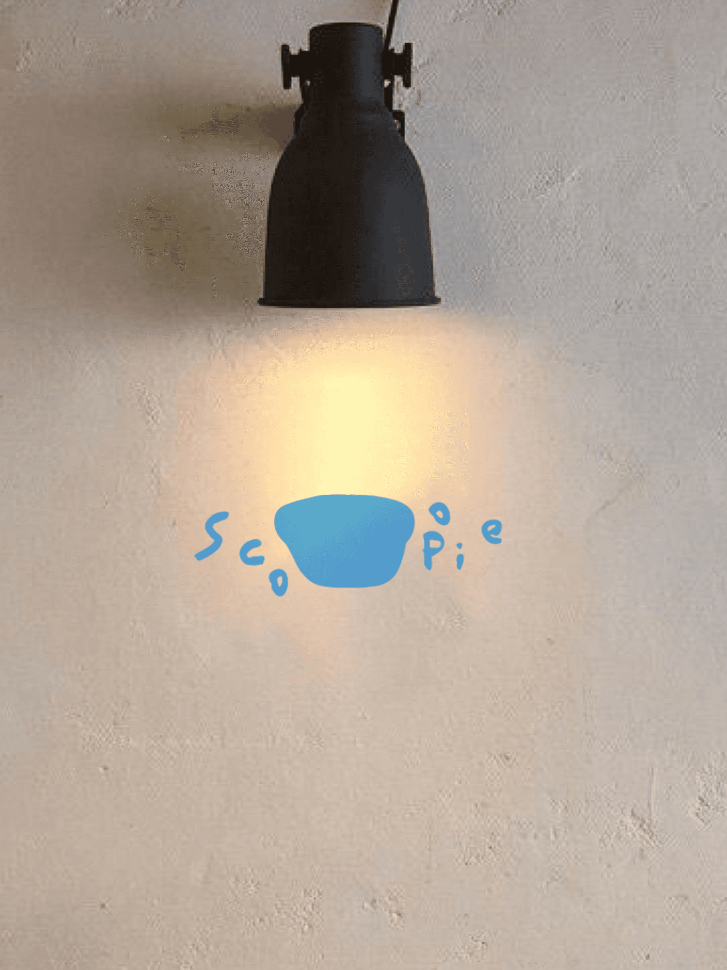
Scoopie是一个以"手工感,治愈"为定位的希腊酸奶品牌,以"Keep it Real, Scoop the Feel"为核心理念。设计上我们放弃严肃的工业感包装,以"手工感的真实"贯穿始终,回归酸奶制作中最动人的两个瞬间:阳光注入奶脂的温暖,与勺子挖起凝固酸奶的满足,传递品牌有温度、有触感、带着呼吸的灵动气质。色彩上我们采用黄蓝配色,是日光与海风的对话,纯净清爽,强化视觉记忆点。几何图形可随产品线或活动变化作为版面的辅助图形,像"酸奶块"一样自由散落,传达"一碗一勺,即是全部"的核心体验。
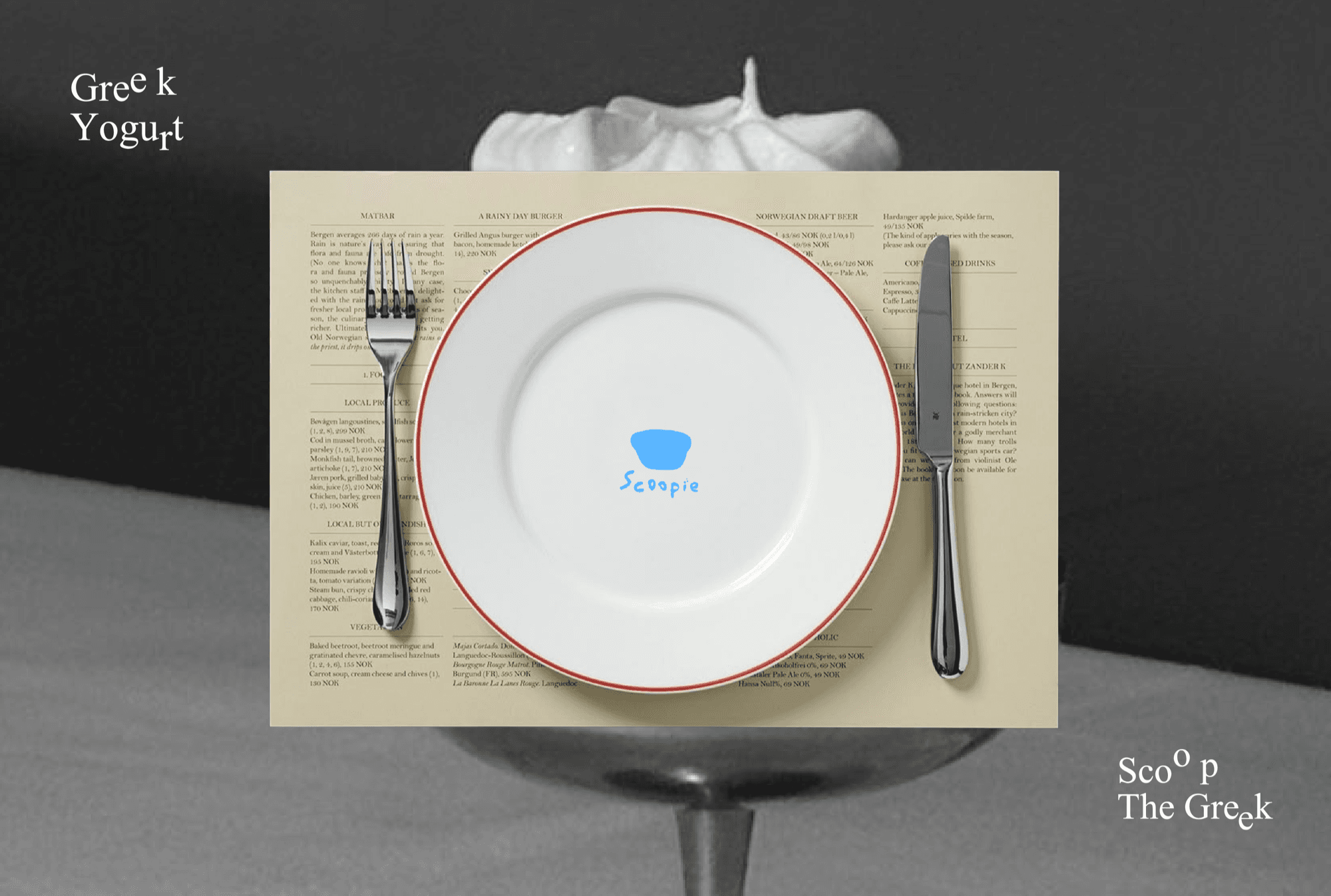
Scoopie is a Greek yogurt brand positioned around "handcrafted feel and healing," with the core concept of "Keep it Real, Scoop the Feel." In design, we abandon serious industrial-feel packaging and let "the authenticity of handcraft" run throughout, returning to the two most touching moments of yogurt making: the warmth of sunlight pouring into the milk fat, and the satisfaction of a spoon scooping up thickened yogurt—conveying a brand character that has temperature, has texture, and breathes with liveliness. For color, we use a yellow-blue palette, a dialogue between sunlight and sea breeze, pure and refreshing, strengthening the visual memory point. Geometric shapes can change with product lines or campaigns as auxiliary layout graphics, freely scattered like "yogurt blocks," conveying the core experience that "one bowl, one spoon, is everything."